Vermont's Independent Voice
Browse News


Browse Arts + Culture


Browse Food + Drink


Browse Cannabis


Browse Music


Browse On Screen


Browse Events


Browse Classifieds
Browse Personals


Published October 17, 2012 at 6:55 a.m.
Political candidates can invest in television ads, email newsletters and hyper-targeted Facebook ads. But despite all the high-tech options available to modern campaigns, those old-fashioned lawn signs persist.
Love ’em or hate ’em, these miniature billboards populate the Vermont landscape for weeks or even months every year, so the least the campaigns could do is come up with good-looking signs. We asked two of our graphic designers extraordinaire, Celia Hazard and Rev. Diane Sullivan, to critique the good, the bad and the ugly of 2012’s crop of lawn signs.
To pick your own favorite, vote in the poll at the bottom of the page.
Cassandra Gekas, candidate for lieutenant governor (P/D)
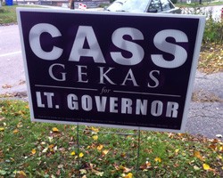
DS: I’m not keen on the mix of fonts.
CH: Yeah, I don’t know about all the fonts. From big and bold to thin and serif...
DS: If I were her, I’d make a joke about Mama Cass. Vote Mama Cass!
Peter Shumlin, incumbent candidate for governor (D)
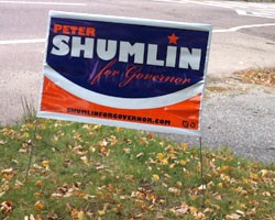
CH: The Shumlin font I like.
DS: I like the “Peter Shumlin” font but the “for governor” font is throwing me off. A nice, cute, fat font, and then all of a sudden you’re going to a wedding.
CH: The swoop is just weird. It makes weird shapes.
DS: He should just never do anything except for a big nose and then call it a day. “The nose knows: Shumlin for governor.”
Bernie Sanders, incumbent candidate for U.S. Senate (I)
Kit Andrews, candidate for state representative (P)
Gene Bergman, candidate for state representative (P)
David Zuckerman, candidate for state senator, Chittenden County (P/D)
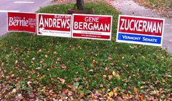
[Note: We loved seeing these three Progressives’ signs, plus “Prog-father” Sanders, displayed next to each other. Who knew Trebuchet was the official Progressive font?]
DS: The little moose is cute.
CH: See, I don’t really like the moose. It’s nice to see different shapes in there, but I feel like if you’re driving by, you’re not going to necessarily know it’s a moose.
CH: The font that they chose for Bernie ... that’s nice.
DS: It’s nice and friendly. I also like the formatting of “for U.S. Senate,” so it’s like “for us” and “for U.S. Senate.”
Jack McMullen, candidate for attorney general (R)
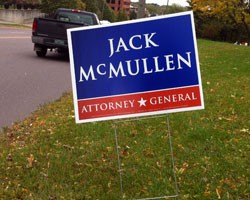
Diane Sullivan: I don’t like a serif font like that, all capitals. It just looks so ... argh.
Celia Hazard: That’s not good. It’s too airy; it almost becomes like you lose the actual wording.
DS: It just looks like a bunch of letters floating around. Is it the leading? Or the kerning. I don’t know, it’s all weird.
Bill Sorrell, incumbent candidate for attorney general (D)
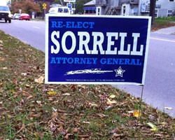
CH: I like the Sorrell font, that’s kinda nice. Like an old Western. The one thing I don’t like is that shooting star.
DS: The star is so graphic-y, and then the shooting thing is like a smudge?
CH: Everything else is super clean, and then that. You can tell that’s not a good stroke.
DS: I do like the light blue over the blue. That’s kinda nice. If the shooting star looked different, maybe if it was a little cleaner, it would be better. Now it throws it off.
Randy Brock, candidate for governor (R)
DS: See, now that’s good lookin’.
CH: I think that’s probably my favorite one. Those lines, the little Vermont in there...
DS: I like the big, fat name, and then the “governor” is not too skinny, not too fat, nicely spaced. He gets a check-plus.


More By This Author


About The Author

Tyler Machado
Bio:
Tyler Machado was the digital media manager at Seven Days. He mostly worked behind the scenes making sure the website, email newsletters and social media feeds stayed in tip-top shape.
Tyler Machado was the digital media manager at Seven Days. He mostly worked behind the scenes making sure the website, email newsletters and social media feeds stayed in tip-top shape.
Speaking of...
-
Vermont Awarded $62 Million in Federal Solar Incentives
Apr 22, 2024 -
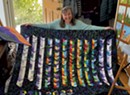
Q&A: Catching Up With the Champlain Valley Quilt Guild
Apr 10, 2024 -

Man Charged With Arson at Bernie Sanders' Burlington Office
Apr 7, 2024 -

Police Search for Man Who Set Fire at Sen. Bernie Sanders' Burlington Office
Apr 5, 2024 -

Video: The Champlain Valley Quilt Guild Prepares for Its Biennial Quilt Show
Apr 4, 2024 - More »
Comments
Comments are closed.
From 2014-2020, Seven Days allowed readers to comment on all stories posted on our website. While we've appreciated the suggestions and insights, right now Seven Days is prioritizing our core mission — producing high-quality, responsible local journalism — over moderating online debates between readers.
To criticize, correct or praise our reporting, please send us a letter to the editor or send us a tip. We’ll check it out and report the results.
Online comments may return when we have better tech tools for managing them. Thanks for reading.