Vermont's Independent Voice
Browse News


Browse Arts + Culture


Browse Food + Drink


Browse Cannabis


Browse Music


Browse On Screen


Browse Events


Browse Classifieds
Browse Personals

Published November 21, 2007 at 1:18 p.m.
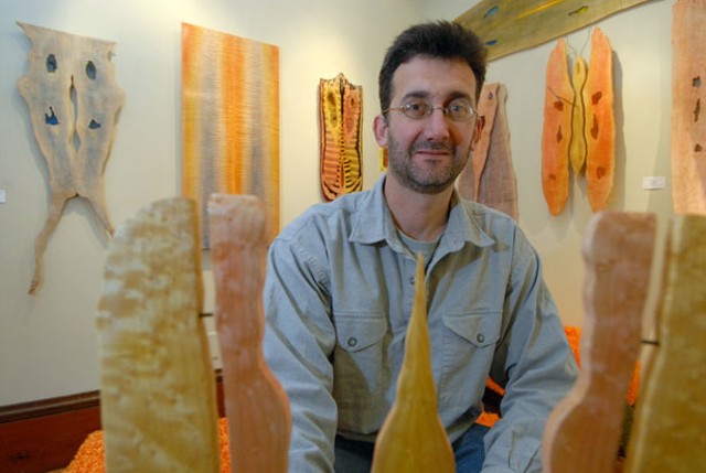
From Superfund to fun? That's the quickest way to describe Robert Hitzig's path from his former job at the Environmental Protection Agency in Washington, D.C., to owning a gallery in Montpelier, Vermont. In 2004, Hitzig and his wife Mary Jo Krolewski decided they wanted a different lifestyle, and a cooler climate. They started scouting small cities in New England. As an environmental scientist, Hitzig was on to global warming before most of us. "We looked at a map and looked at Vermont," he says simply, "and it seemed like the place to go."
The couple traded the nation's capital for the smallest state one, buying a grand Victorian next to the roundabout on Main Street in Montpelier. They refurbished it inside and out, painting all the "gingerbread" a cheerful salmon-pink. With four apartments upstairs generating rental income, Hitzig and Krolewski justified the installation of a riskier business - an art gallery - on the first floor.
Both have self-taught art backgrounds. Krolewski makes pillowy items such as giant faux cupcakes out of fabric. Hitzig was a woodworking hobbyist whose love for the medium gradually shifted into a fine-art métier: making whimsical, beautifully crafted wood sculptures. Perhaps to counter a grim global prognosis, the couple let their lightheartedness guide their vision for the gallery.
The Lazy Pear is devoted to Vermont-made art that is playful, quirky or downright funny. The moniker came, Hitzig reveals, from a word-play brainstorming session with a friend. "Someone said 'Laissez-faire,' and someone else said, 'Lazy Pear,'" he recalls, adding with hindsight logic, "Pears are very artsy fruit - you see them all the time in still lifes."
That art-historical reference might be lost on most visitors, despite the pair of pears Hitzig carved on the wooden sign outside. Neither still lifes nor any other classic compositions are likely to be found on these walls and shelves. Not without a twist, anyway. Hitzig says the gallery's identity has evolved a bit to embrace some abstract and surreal art, as well as a few out-of-state artists. But while the work is high in quality, and well on the right side of kitschy, a stroll around The Lazy Pear is still a good antidote for gloom.
There's the bakery display case filled with Krolewski's fabric food items, and her orange fake-fur benches in the shape of, for example, a Creamsicle. There are black-and-white, cleverly surreal photographic images by Wendy James; portraits of dogs with quizzical faces by Anna Dibble; ceramics in the shape of falling-down buildings and a child-sized toy car, by John Brickels; and cute carved animals by Timothy Fisher. There are creepy, bird- and rabbit-headed figures by Beth Robinson, and Janet Van Fleet's anthropomorphized sticks-and-stones creations.
And then there are Hitzig's wood sculptures, scattered around the gallery. Their fanciful expressions belie a left-brain life experience. His "circuitous path," as Hitzig puts it, includes an undergraduate degree in geology and history, a graduate degree in environmental science, and three years as an agro-forester in Africa with the Peace Corps. His work at the EPA, where he specialized in underground storage tanks and waste sites, seems only to have intensified his reverence for nature.
On his website, Hitzig expounds lovingly on his chosen medium: "The natural grain patterns found in wood, the shape, the color, and texture are more beautiful than anything I can imagine," he enthuses. "Wood is alive and a work of art itself."
The two-dimensional wall-hung works are indeed monuments to inner beauty - that is, of trees. But Hitzig is still a sucker for animal magnetism, finding figurative elements in the wood's patterns. Most of his works "bookmatch" two cut, planed boards - that is, they mirror each other. "It's my own personal Rorschach test," he suggests. "I look for a face or animal shape first; if I don't see it, I go for abstract."
Hitzig bores out irregular shapes "where the grain pattern creates a place for a hole" - they may approximate eyes and a nose, or just be random design features. Then he fills these negative spaces with dyed epoxy, achieving a sort of stained-glass look. When this dries, the whole surface undergoes a meticulous finishing process that involves layer on layer of tinted shellac and lots of polishing.
"It's called a French polish," Hitzig says. "You take a ball of cloth and mix oil, shellac and alcohol; the oil helps because the shellac and alcohol dry out quickly. It works like a Zamboni on ice," he explains. "It dissolves the previous layer [of shellac] while adding a new one. The result is perfectly flat - no dust, no dull spots or marks."
The finished product looks so lustrous you want to reach out and stroke it, which Hitzig encourages you to do. The shellacking and polishing bring out the ribbony grain - further enhanced by the application of soft color - and make the surface satiny-smooth. You can't help thinking, This would make a gorgeous table top; after all, it's a look that generations of fine furniture craftsmen have achieved. But while Hitzig can make furniture, "I want to focus on art," he insists. "I think it loses value as functional work."
Hitzig's recent collaborative works with painter Cristine Cambrea look like something the Austrian Art Nouveau master Gustav Klimt might have produced if he'd worked in wood. But what sets Hitzig's creations apart from most other art-that-comes-from-trees is the marriage of the medium's sensuous beauty and his humorous aesthetic.
A sculpture's shape beckons from across the room. "Living with Ambiguous Directionality" is the title of a piece that vaguely resembles some primitive sea creature. Oriented horizontally, the 13-by-53-inch hunk of curly maple features fish-like "tail fins" and, on the other end, jagged teeth that Hitzig cut with a band saw and gilded with gold metallic paint.
"Geiselius myrmecophagia" - a title that references both Dr. Seuss (Theodor Geisel) and the scientific name for anteaters - is a vertical, 35-by-16-inch work with a pinkish tint and an appendage connected on top. Yep, it looks like the long-snouted head of an anteater, and this one has real turquoise eyes.
"Castleris vermontensis" is a 32-by-12-inch assemblage with the unmistakable form of a winged insect or butterfly. It even has two metal antennae at the top and another, for good measure, poking from its center.
Many of Hitzig's titles seem lifted from a biology textbook, and his more protozoic shapes resemble something you'd see under a microscope. In other words, he's found a way to indulge his inner science geek while carving out - literally - an identity as quite a different species: fine artist.
Art Starter
Rob Hitzig is dedicated to making Vermont's capital city a "destination for the arts," and toward that goal he's contributed more than just a gallery. As a board member of the Montpelier Downtown Community Association, he's spearheaded a monthly Art Walk and advocated for other arts-friendly events.
The MDCA's latest project is "SculptCycle," a public-art partnership that aims to "connect art, business, fitness and environmental communities." The idea is this: A selected group of artists will create sculptures from unwanted bicycles and parts, to be displayed around downtown Montpelier next summer and fall. With proceeds from a silent and live auction of the works, MDCA will continue to promote the downtown and public art.
Along with being a clever double entendre, "SculptCycle" is a project with loads of eco-cachet in the center of green Vermont. Hitzig recently issued a call-to-artists press release: Interested artists can call him at 223-7680. Potential sponsors should call Suzanne Hechmer at 223-9604. For more info, visit www.sculptcycle.org. The exhibit and attendant community activities will commence next spring.
P.P.
Related Stories

More By This Author

About The Author

Pamela Polston
Bio:
Pamela Polston is a cofounder and the Art Editor of Seven Days. In 2015, she was inducted into the New England Newspaper Hall of Fame.
Pamela Polston is a cofounder and the Art Editor of Seven Days. In 2015, she was inducted into the New England Newspaper Hall of Fame.
Speaking of...
-

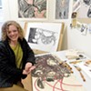
Q&A: Downtown Montpelier Transforms Into PoemCity Every April
Apr 24, 2024 -

Video: Visiting the Kellogg-Hubbard Library’s PoemCity in Montpelier During the Month of April
Apr 18, 2024 -

Ondis Serves Seasonal Fare With a Side of Community in Montpelier
Apr 16, 2024 -

Totally Transfixed: A Rare Eclipse on a Bluebird Day Dazzled Crowds in Northern Vermont
Apr 10, 2024 -
Q&A: Catching Up With the Champlain Valley Quilt Guild
Apr 10, 2024 - More »
Comments
Comments are closed.
From 2014-2020, Seven Days allowed readers to comment on all stories posted on our website. While we've appreciated the suggestions and insights, right now Seven Days is prioritizing our core mission — producing high-quality, responsible local journalism — over moderating online debates between readers.
To criticize, correct or praise our reporting, please send us a letter to the editor or send us a tip. We’ll check it out and report the results.
Online comments may return when we have better tech tools for managing them. Thanks for reading.