Vermont's Independent Voice
Browse News


Browse Arts + Culture


Browse Food + Drink


Browse Cannabis


Browse Music


Browse On Screen


Browse Events


Browse Classifieds
Browse Personals

Published May 17, 2023 at 10:00 a.m.

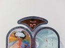
The current exhibition at Northern Daughters is like spring in a box, in more ways than one. The first box is the "white cube" of the Vergennes gallery itself. The second is the grid-based structure of the artwork on view. Yet the feeling of spring is not to be restrained: In Carla Weeks' solo show of paintings, color is a vibe, and it fairly bursts from the walls.
The exhibition is actually a meticulous study of one color — green — and is grandly titled "Verdant." Weeks' 19 oil-and-colored-pencil works on panel, created over the past two years, are beguiling chromatic iterations that illustrate the limitations of language: Green is not a single entity but a collective whose members have freely coupled with other hues; their names require adjectives.
Weeks, who has a degree in art history and a professional background in design, lives and works in Maine. For the paintings in "Verdant," she took color cues from the surrounding forest. But the paintings also present her distinctive iconography and arrangement of forms inspired by architecture.
The disciplined structure of a grid is the foundation for Weeks' tidy, and often recurring, compositions. Yet she offsets the strict linearity of squares and rectangles with curves: arcs, arched "windows," circles and other rounded shapes. Call it a feminine response to Josef Albers' unvarying squares.
Within each of the shapes in her grid, Weeks mixes a color that is closely related to the neighboring one. Even in paintings that appear nearly monochromatic, a closer look reveals minute fluctuations in tone as well as the brushy texture of oil paint — which, in its way, further humanizes the grid.
In a phone conversation, Weeks talked about color, form and taming chaos.
Let's start with color. I don't even have words for the multitude of hues in your works. Are all the colors mixed? Do they exist in a Pantone color chart?
They probably do, but I don't plan or calculate color; it's more of an organic process. I don't know what I'm going for; I just know when it feels right.
I like the work to be very monochromatic. I know the core colors I'm using, but then I'm mixing it with many others.
I looked at the paintings organized by year on your website. It seems you've been on this path for some time, articulating closely related hues on a single panel. Do you recall how it first occurred to you to do that?
It was kind of a reaction to COVID. I was inside a lot and so anxious. I do a lot of murals and commissions, and a lot of them were canceled. I told myself I wanted to make work that was very calm and an antidote to the anxiety.
I looked at the vocabulary of shapes that I'd used over past years and thought about what makes it my own language. I tried to distill that down and came up with a family of images that, to me, felt articulated, like they were mine.
Simultaneously, I had been wanting to dive deep into color studies, to be conscious about why I was choosing colors. I wanted to go into a meditative state when I was painting. This was my way of working with color without it feeling chaotic. It was energizing in a calm way. Before that, I had only used very muted colors.
You've partially answered my next question, which is about your compositions. They're very controlled, based on a grid. Then the inclusion of arches seems to soften the rigid structure. What do these forms mean to you?
I don't think at the time I thought about why I was using that form. But the more I worked on those pieces, [the more] I thought about the idea of the arch — the idea of being held, contained. I have friends who are mothers who tell me it makes [the paintings] feel feminine. Those specific ideas weren't in my mind, but they make sense — especially when you're making them at a time when everything is scary. But I am just drawn to the arch form — it's such a feat, architecturally.

On your website, you say you "use abstraction to articulate the subtleties and nuance of sensory memory." Can you elaborate on that?
If you look through the work on my site, by year, I'm usually focused on one or more specific places. Where the memory component comes in is how we experience place over a period of time — even on vacation, seeing a similar thing over and over again.
I love the opportunity to show the multiplicity of ways we remember. [With] a composition that repeats on different artworks, I get to explore the feeling of a place through color and shape.
In support of that idea, the works in "Verdant" speak to the colors in the forest — the trees, the moss, the lichen — where you live.
Yes, the coast of Maine. Technically, we're on an island, but you wouldn't know it when you're here; it's very densely forested.
Many of the pieces in this show are titled "Stained Glass Study"; others are "Arrowsic Window." Both of those imply contained structures that we look through. Within these structures, you "contain" colors in specific forms. What are you thinking in this process? Were you really thinking about windows?
We moved to Maine two years ago, in the winter, so we got to see everything come out in the spring. We moved here from Philadelphia, so it was an extreme change. I felt I was drinking in that color. It just felt natural to process that in my work.
We live in a 1970s timber-frame house with big windows that look out at the trees. So I was thinking about this literal gridded framework — I see it at all times of day, in all kinds of light throughout the year. There are so many greens.
I studied art history, and I used to work full time as a designer. I was thinking a lot of the arts-and-crafts movement — it's an interesting middle ground between architecture and nature. I was simultaneously thinking about my new home through the architectural framework of the windows and also this piece of design history that I'm instinctually drawn to.
Often, with a body of work, I might have two ideas and I don't even know how they connect, but in making the work, I see how it fits together. For me, that connection is architecture and nature. I live in a natural environment now. [Painting is] my way of marrying those things together and finding the relationship between the two: the nature of a place and how we relate to it through the container, the building, we live in. And how architecture and design inform and influence our experience of nature.
Your designs are rigid, but the brushwork within the internal forms clearly shows your hand. I appreciate that combination of structure and fluidity.
Thank you. I look at a lot of minimalist art, and it's very flat and graphic. Other artists comment on the fact that I use oil paint. I want crisp guidelines but a whole world within the shapes. The graphic with the soft, the architectural with the organic, the masculine with the feminine — all in one image.
This interview was edited and condensed for clarity and length.
The original print version of this article was headlined "Seeing the Forest | In "Verdant," Carla Weeks' paintings explore a world of greens — and grids"

Related Locations
-
Northern Daughters
- 221 Main St., Vergennes Middlebury Area VT 05491
-
 802-877-2173
- www.northerndaughters.com
More By This Author


About The Author

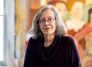
Pamela Polston
Bio:
Pamela Polston is a cofounder and the Art Editor of Seven Days. In 2015, she was inducted into the New England Newspaper Hall of Fame.
Pamela Polston is a cofounder and the Art Editor of Seven Days. In 2015, she was inducted into the New England Newspaper Hall of Fame.
Speaking of...
-
In 'Circles & Squares' at Hexum Gallery, Two Artists Minutely Manipulate the Mundane
May 8, 2024 -
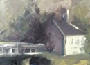
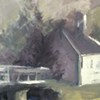
In ‘Painting the Town,’ Julie Davis Pays Tribute to Johnson Landmarks
May 1, 2024 -
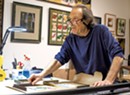
Art Is Life for Painter and New Burlington Gallerist Stephen Zeigfinger
Mar 27, 2024 -
Pievy Polyte's Vivid Paintings Whisk Vermont Viewers to Haiti
Jan 24, 2024 -
Pianist Diane Huling Presents a Show of Her Other Passion: Visual Art
Dec 13, 2023 - More »
Comments
Comments are closed.
From 2014-2020, Seven Days allowed readers to comment on all stories posted on our website. While we've appreciated the suggestions and insights, right now Seven Days is prioritizing our core mission — producing high-quality, responsible local journalism — over moderating online debates between readers.
To criticize, correct or praise our reporting, please send us a letter to the editor or send us a tip. We’ll check it out and report the results.
Online comments may return when we have better tech tools for managing them. Thanks for reading.